


Mobile optimization strategies are techniques used to make websites load faster, display correctly, and provide a seamless user experience on smartphones and tablets.
These strategies include responsive design, image compression, viewport configuration, and Core Web Vitals optimization.
With over 64% of web traffic coming from mobile devices, implementing effective mobile optimization strategies is essential for ranking higher in Google search results. 
Why Mobile Optimization Matters for SEO
Google now uses mobile-first indexing, meaning it primarily evaluates your mobile site version for rankings. If your website performs poorly on mobile devices, your search visibility will suffer regardless of how good your desktop version looks. This shift makes mobile optimization a top priority for every website owner.
The numbers speak clearly. Mobile users expect pages to load in under 3 seconds. Sites that fail this benchmark experience up to 53% higher bounce rates, directly impacting their SEO performance and overall mobile optimization effectiveness.
Responsive Design as Your Foundation
Responsive design automatically adjusts your website layout based on screen size. This approach uses flexible grids, fluid images, and CSS media queries to ensure content displays properly on any device.
| Design Approach | Pros | Cons |
| Responsive Design | Single URL, easier maintenance | May load slower initially |
| Adaptive Design | Device-specific optimization | Multiple versions to maintain |
| Separate Mobile Site | Full control over mobile UX | Duplicate content risks |
The recommended approach is responsive design because it simplifies SEO management with a single URL structure while providing consistent user experience across all devices.
Viewport Configuration Done Right
The viewport meta tag tells browsers how to scale your page on different screens. Without proper configuration, mobile browsers may render your site as a scaled-down desktop version, causing usability issues.
Here is the standard viewport configuration:
<meta name="viewport" content="width=device-width, initial-scale=1.0">This simple code ensures your website adapts to the device width automatically, preventing the 300ms tap delay that hurts user experience and mobile optimization scores.
Speed Optimization Techniques
Fast loading speed directly impacts both user experience and search rankings. Google considers page speed a ranking factor, especially for mobile searches where users expect instant results. Your mobile optimization strategies must prioritize speed above almost everything else.
Image Optimization
Images typically account for 50-70% of total page weight. Proper image optimization is crucial for mobile performance. Implement these practices:
✓ Use WebP format for 25-35% smaller file sizes
✓ Implement lazy loading for below-the-fold images
✓ Set explicit width and height attributes
✓ Use responsive images with srcset attribute
Code and File Compression
Minifying CSS, JavaScript, and HTML removes unnecessary characters without affecting functionality. Enable GZIP compression on your server to reduce file transfer sizes by up to 70%. These techniques form the backbone of successful mobile optimization.
Core Web Vitals for Mobile Success
Core Web Vitals are Google’s metrics for measuring real-world user experience. These three metrics directly influence your mobile optimization strategies success and determine how Google evaluates your site quality:
| Metric | What It Measures | Good Score |
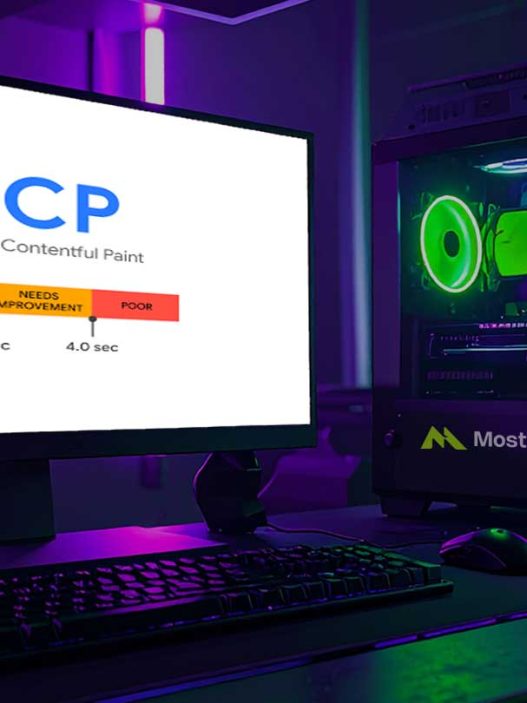
| LCP (Largest Contentful Paint) | Loading performance | Under 2.5 seconds |
| INP (Interaction to Next Paint) | Interactivity | Under 200 milliseconds |
| CLS (Cumulative Layout Shift) | Visual stability | Under 0.1 |
To improve LCP, optimize your largest visible element, usually a hero image or heading. For INP, reduce JavaScript execution time. For CLS, always specify dimensions for images and embeds. Mastering these metrics is essential for any mobile optimization effort.
Touch-Friendly Navigation Design
Touchscreen usability requires larger tap targets and adequate spacing between interactive elements. Google recommends tap targets of at least 48×48 pixels with 8 pixels of spacing between them.
Keep navigation simple and accessible. Use hamburger menus for mobile, but ensure critical links remain visible. Avoid hover-dependent interactions since touchscreens cannot detect hover states.
Handling Pop-ups and Interstitials
Google penalizes intrusive interstitials that block content on mobile devices. Minimal pop-ups improve user experience and protect your rankings from penalties.
Acceptable practices include:
✓ Cookie consent banners required by law
✓ Age verification for restricted content
✓ Small banners that use reasonable screen space
✗ Full-screen pop-ups appearing immediately
✗ Standalone interstitials before main content
✗ Layouts where above-the-fold content appears like an interstitial
Accelerated Mobile Pages Consideration
Accelerated Mobile Pages (AMP) is Google’s framework for creating ultra-fast mobile pages. While AMP can improve loading speeds dramatically, it comes with limitations on design flexibility and functionality.
Consider AMP for content-heavy pages like news articles and blog posts where speed is critical. For e-commerce or complex applications, focus on optimizing your standard mobile-friendly layout instead.
Testing Your Mobile Performance
Regular testing ensures your mobile optimization strategies remain effective over time. Use these tools to identify and fix issues before they impact your rankings:
Google PageSpeed Insights provides both lab and field data for your pages, along with specific recommendations for improvement. This tool is essential for any mobile optimization assessment.
Google Search Console offers mobile usability reports showing pages with issues like text too small, clickable elements too close, or content wider than the screen. Check this report weekly to catch problems early.
Chrome Lighthouse runs comprehensive audits covering performance, accessibility, and SEO factors in one report. Run Lighthouse audits after every significant site change to maintain your mobile optimization standards.
Quick Implementation Checklist
Follow this checklist to ensure comprehensive mobile optimization:
✓ Implement responsive design with proper viewport tag
✓ Optimize images using modern formats and lazy loading
✓ Minify and compress CSS, JavaScript, and HTML files
✓ Achieve Core Web Vitals passing scores
✓ Design touch-friendly navigation with adequate tap targets
✓ Remove or minimize intrusive pop-ups
✓ Test regularly using Google’s mobile testing tools
✓ Monitor mobile usability in Search Console
Start Improving Your Mobile Rankings Now
Mobile optimization strategies are no longer optional for websites aiming to rank well in search results. With Google’s mobile-first indexing fully implemented, your mobile site performance directly determines your overall search visibility.
Start by testing your current mobile optimization score, prioritize the highest-impact fixes, and continuously monitor your Core Web Vitals to maintain competitive rankings in 2026 and beyond.
References
- Statista. Mobile Share of Global Web Traffic 2024-2025. Statista Research Department
- Google Developers. Mobile-First Indexing Best Practices. Google Search Central Documentation
- Google Chromium Blog. Introducing Interaction to Next Paint. Web Vitals Update 2024
- Search Engine Journal. Mobile SEO Best Practices Guide. December 2024
- Backlinko. Mobile SEO: The Definitive Guide. April 2025
- Google PageSpeed Insights. Core Web Vitals Assessment Guidelines. Google Developers